Creating an effective and user-friendly menu is essential for navigation across your OTT apps (Android, iOS, Smart TVs, etc.). The menu allows users to quickly access various sections like Home, TV Shows, Movies, Live TV, Audio, Categories, Search, and more.
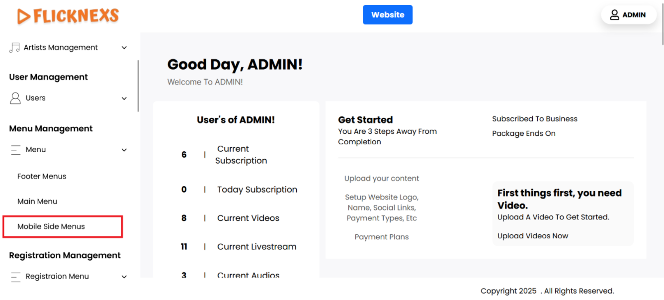
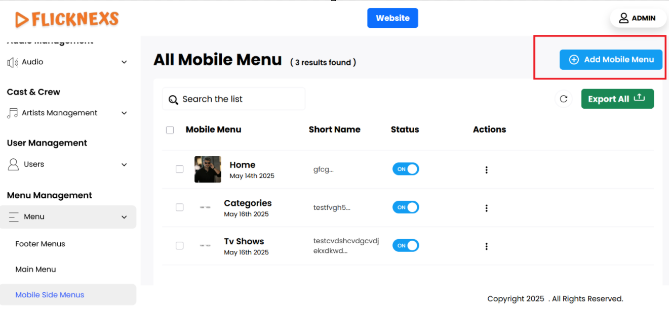
Mobile Side Menu
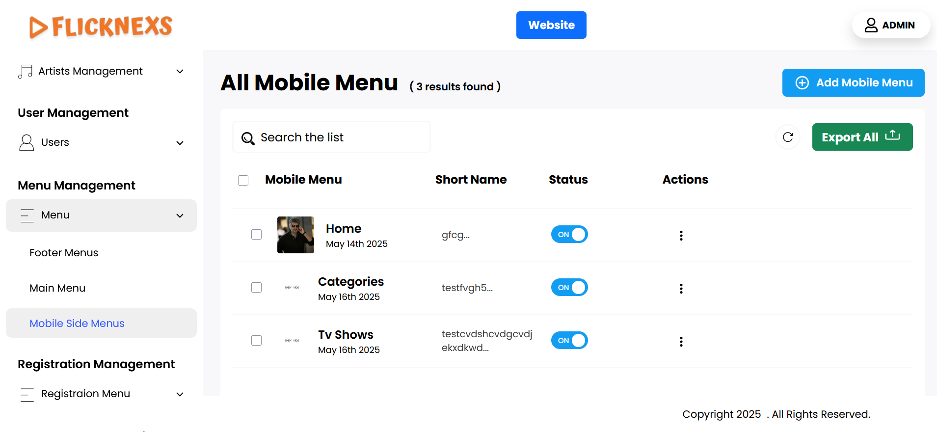
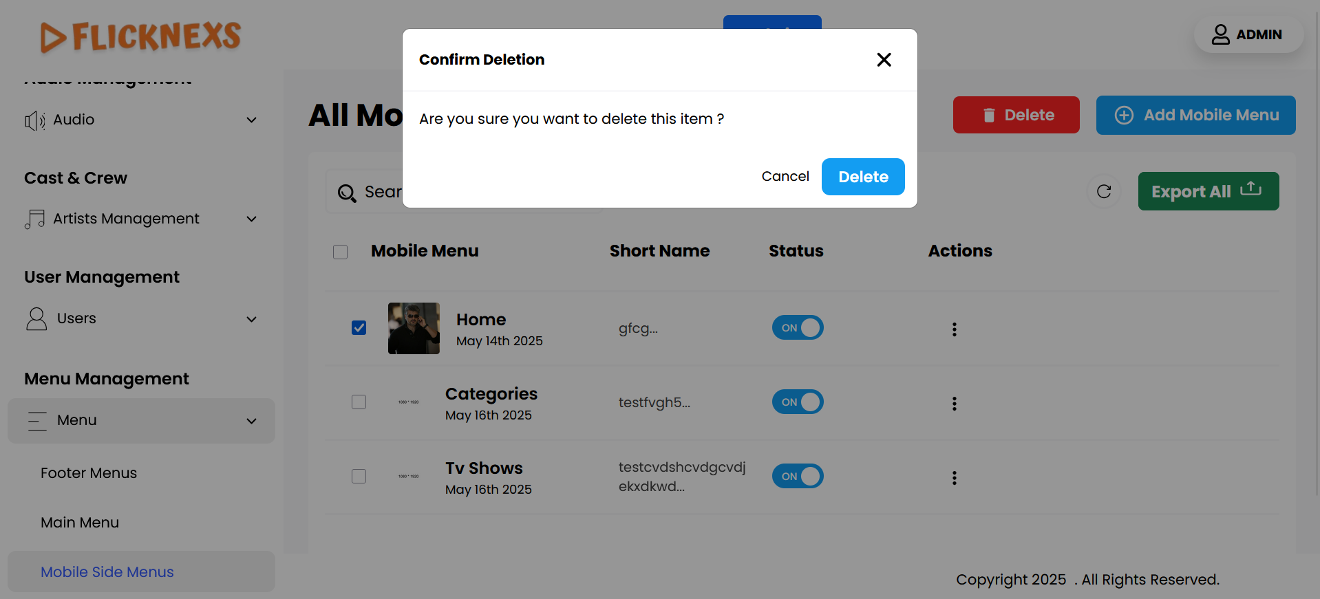
You can view a comprehensive list of mobile side menus, which includes several key attributes for each menu item:
- Mobile Menu: Each menu item is represented by an icon, which visually indicates its purpose. This helps users quickly identify the functions of various menus in the mobile view.
- Name of the Menu: This column displays the title of each menu item. It is important that the name is clear and descriptive, allowing users to understand what content or functionality they can access by clicking on the menu.
- Short Name: This section provides a brief description or note associated with each menu item. The short note offers additional context about the menu’s content, helping users make informed decisions about which menu to select.
- Status: This setting allows you to control the visibility of the menu in the mobile side menu. If you want the menu to be displayed, you should enable this option. Conversely, if you prefer not to show it, you can disable this setting to hide the menu from the mobile side menu.
- Action: For each menu item, you have two options for managing the menus:
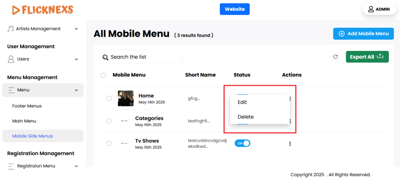
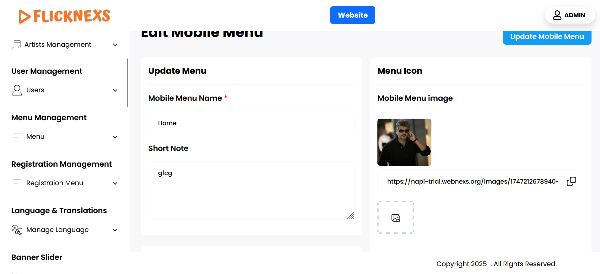
- Edit: When you select this option, you can make changes to the menu item. This includes updating the mobile menu image, changing the name of the menu, and modifying the short note. Editing allows you to keep the menus current and relevant as your app evolves.
- Delete: If you decide that a particular menu is no longer needed, you can choose this option to permanently delete the menu from the list. This helps keep the mobile view organized and free of unnecessary items.
These features provide you with complete control over the mobile view side menus, allowing you to customize and manage the navigation experience effectively for your users.
Add New
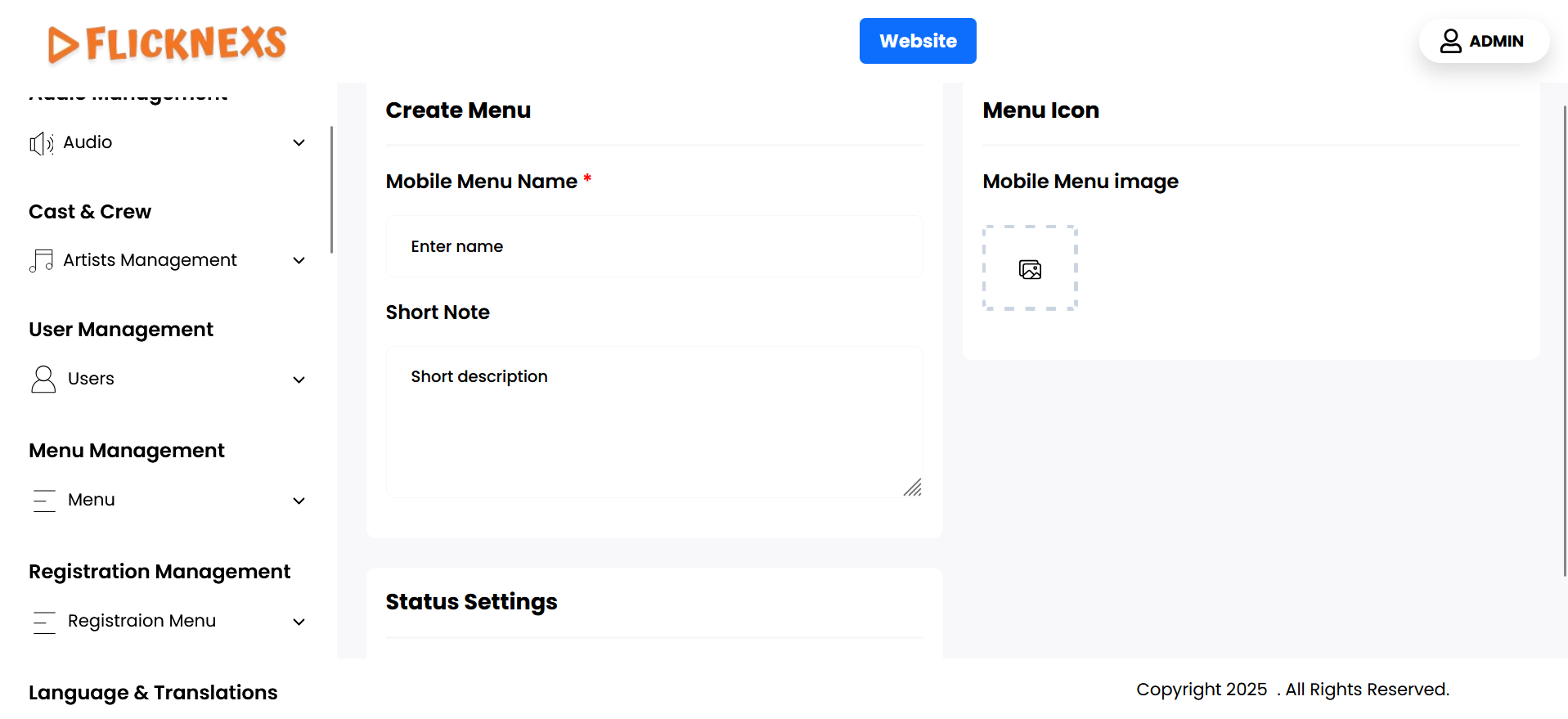
You can easily add a new mobile side menu by following these steps:
- Menu Icon: Start by uploading an icon image that will represent the mobile side menu. This icon should be visually appealing and relevant to the menu’s purpose, as it will help users quickly identify the menu item.
- Mobile Menu Name: Next, enter a name for the new mobile side menu. This name will be displayed to users and should clearly describe the menu’s function or content. Choose a concise and descriptive title to ensure that users understand what the menu offers.
- Short Note: You can also enter a brief description or note for the menu. This short note can provide additional context or details about what users can expect when they select this menu item. It can help enhance the user experience by guiding them on the menu’s content or purpose.
- Status: This setting allows you to control the visibility of the menu in the Mobile side menu. If you want the menu to be displayed, you should enable this option. Conversely, if you prefer not to show it, you can disable this setting to hide the menu from the side menu.
- Save Changes: After you have filled in all the necessary details—icon image, name, and short note—click the “Save Changes” button. This action will add the new mobile side menu to your platform, making it accessible to users on their mobile devices.
By following these steps, you can effectively customize the mobile navigation experience, ensuring that users can easily access the features and content they need.